i really love the idea and the crop (it could show i little more of his face to the left to concentrate more on this protrait issue though), it's kinda similar to mine...
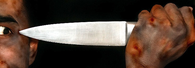
the tension of the photo is immense, caused by the crop, the eye and the point, where the knife touches the skin.
the pp (especially the dodging, burning and selective desats) is quite obvious and maybe a little much, but it surely helps to intense the bloody look of the photo ;)
all in all: definately out of the box and not the most classic portrait, but it's a creative idea and execution! An 8
I'm not really buying this as a "Portrait" shot. Seems more like something from a horror movie poster. Guess that's good in it's own way, but not for this challenge IMO. Good luck.
A little too much brightness in the eye? looks a bit "painted on" to me. I would have like to see a little more of the face, maybe to the nose? Great concept and lighting!







 Add photograph to your favorites
 Add photographer to your favorites


 Photographer found comment helpful.


