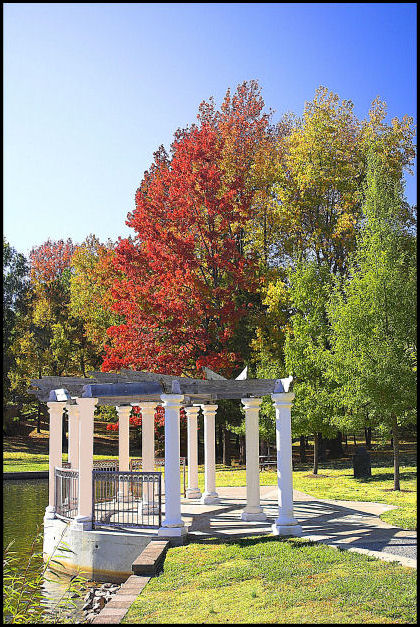
I like the subject matter and the autumn colors. I was really surprised I got such blue colors using a polarizer on my lens and doing some simple saturation. I want to learn how to do PP layers to enhance a skyline, but if I can do it 'naturally' then I'm pretty happy with it too.
Decided to play with another color border as my solid color border tanked, but after I look at it more and more, going with basic black would be best. I would like to see a decent score again.
Hoping, though I should know better by now, to FINALLY hit the 5.5 mark. We'll see. Was going to enter this into the Free Study, but based on the way my first Free Study went, I figured I'm better off in a landscape challenge since my post processing abilities are not very strong.
Post processing:
USM
Sharpen
Brightness/Contrast
Saturation of colors using hues/saturation
Clone some pixelation off of columns
Add border
resize for web
--------------------------------------
Post challenge comments: Well, at least after days and days of being under 5, it finally bounce back up above the mark in the final 24 hours.
Statistics
Place: 199 out of 308 Avg (all users): 5.1062 Avg (commenters): 4.7500 Avg (participants): 4.8072 Avg (non-participants): 5.2797 Views since voting: 985 Views during voting: 292 Votes: 226 Comments: 9 Favorites: 0
I think of only natural elements in a portrait. If it is a landscape portrait then "sport" only landscape person portrait = main emphasis on the person
I think you just over-exposed this a little. The colours feels washed out and there appears to be a slight haze over the image. Maybe rectify this with a nudge of the contrast slider.
I really like the light and idea of this photograph but I think it is sharpened a bit too much to portray that relaxed feeling this subject should have.





 Add photograph to your favorites
 Add photographer to your favorites


 Photographer found comment helpful.


