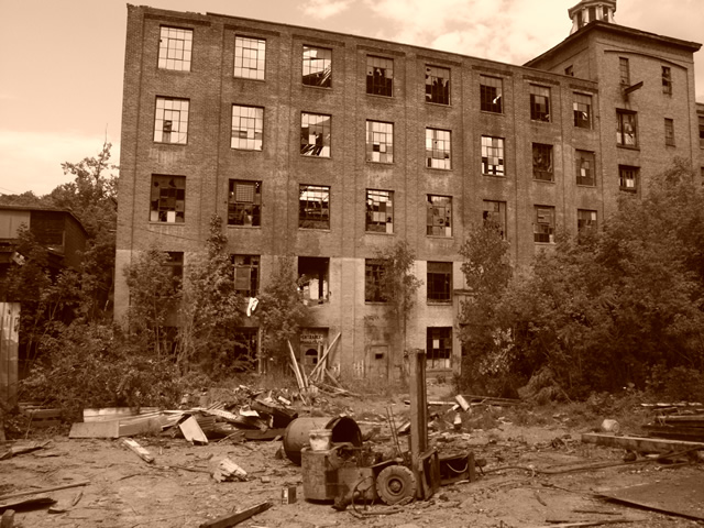
this is a great subject for the challenge, and a well done photograph as well. the sepia toning was a great idea. The only way I could think of to make this photo better would be to wait for the lighting to improve.
Good subject. Sepia tone is unneccessary, as the subject is quite evocative of feelings of oldness by itself. I would have shot this one in a similar fashion.
this is good when everything in thr frame is old -- both the backdrop and the foreground. heck even the bushes look untended for years. the broken windows look great, and the non-broken ones reflect enough to give the illusion that this is just one standing wall left. great shot
Sepia effect worked nicely for you, the framing could use a bit of work -- take off the dead space on the left, and give a pinch more to the top and right.
Good subject but in your effort to keep the foreground debris in the shot you've had to crop too close to the top of the building. This spoils the framing in my opinion. Sepia didnt work too well here, perhaps because it's a little too red and a little too dark over all.
This would have been great in the Corporate World thing. Good here too. The junk kind of overpowers the old for me though. A closer shot of the building would have been more powerful. Autool






 Add photograph to your favorites
 Add photographer to your favorites


