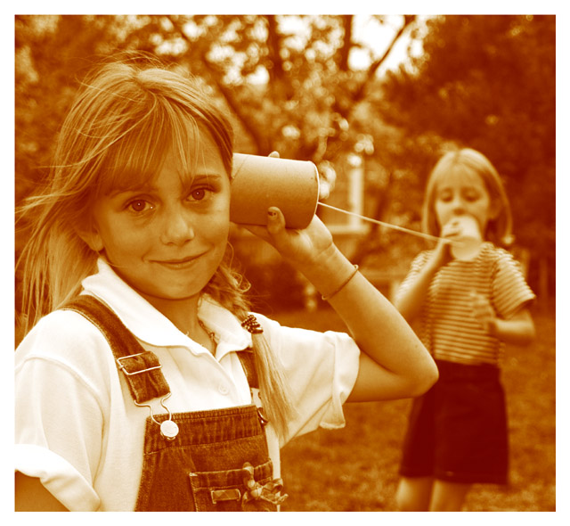
The young ladies had never seen a cup and string communications device before, had a time trying to get them to hold the line taught so that it worked. When it did, their eyes lit up! Used sepia to give this more a time period feel.
Statistics
Place: 11 out of 172 Avg (all users): 6.5270 Avg (commenters): 8.3333 Avg (participants): 6.3483 Avg (non-participants): 6.6316 Views since voting: 1866 Votes: 241 Comments: 39 Favorites: 5 (view)
Like I said about the color, purely a matter of personal taste. As you can see, everybody has a different one (taste that is :). From the scores, looks like everybody realized that anyhow and gave you great marks.
It's an excellent photo no matter how you decide to duotone it. Keep it up!
well? I smile when i think about what could have been. Eight comments said not sure about color. Nine comments liking color...Now I am confused:) I guess I need some feed back on peoples thoughts...
needs a little contrast and imo is way too yellow...I played around with it in photoshop and saw what I suspected all along....this is a stunning photograph...really beautiful...here is a link to the one I messed with...I hope you don´t mind... //www.geocities.com/inga_fang/dpc.html ... I am giving this one a 10...i really like it
Adorable picture. The DoF, expressions and color bring back memories of experimenting with tin cans and strings (among other things) back when I was younger.
The only thing I do not like about the shot is the "flash" reflection in the near girl's eyes and in the corner of her right (looking at, left) eye. I also may have cropped a bit differently on the left side showing more of her shoulder/arm.
A well composed photo. I like the feeling of antiquity that the duotoning gives, but it feels a little orangy for me (just a matter of personal taste). Overall, a great photo!
Nice shot. Good dof and great expression on the girl in the foregrounds face. I personally would have liked to have seen more contrast, but other than that, great image.
wonderful composition and I think it works well in monotone, but I don't care for this particular choice of color. I think it would have worked better as a black and white. still it is better than most of the images I have seen thus far.
With a less orange colour tone this would have been a 10.
As it is I think it's a wonderful image that captures beautifully that early childhood wonder with the basics of science.
Nice use of depth of field to show distance of furthest child from main subject.
Eye contact from front child absolutely makes the image work.
9
Childhhod science - I love it. That "wonder" is where all science starts. The sepia tone works for me too - definitely one of the best. I'll give it a 9 and review after seeing all the others. Congratulations!
This has a very sweet, old-fashioned feel to it which is a great way to enhance your overall theme. Using the sepia tones is perfect for this shot and your cropping is right on. I even like the border since this reminds me of pictures the way they used to be developed way back when I was a kid. Nicely done.
This is the best photo in the challenge. I love the color tone, the dof, the subject, the idea. Everything is perfect here, I wouldn't change a thing. I really hope this beats out the technical heavy science shots.
Very, very good photo, technically. I wonder about the girl's expression, though, as she isn't smiling with her eyes. It disturbs the mood by adding confusion to the basic atmosphere of innocent curiosity.







 Add photograph to your favorites
 Add photographer to your favorites

 Photographer found comment helpful.


