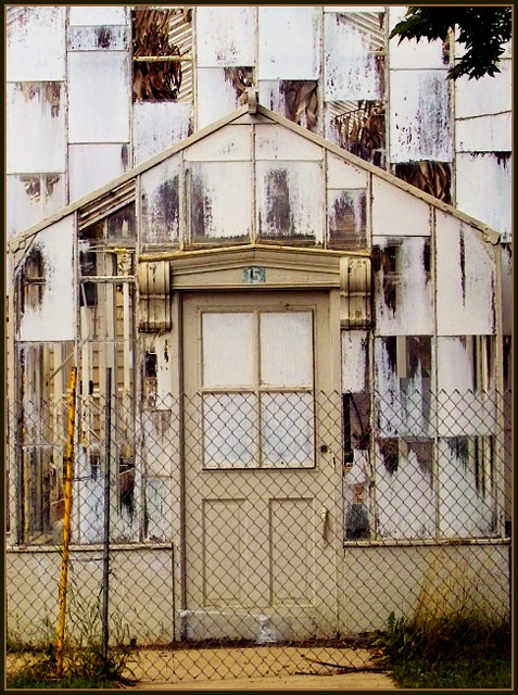
I really like this shot for originality and execution. It presents the subject matter in a nicely designed way with the messy decor creating the textural interest in the shot. Nice composition. [8]
My initital reaction on this shot is that it's too much, to bright, to white, too exposed! So of course it fits the challenge perfectly! The brightness on this shot works against you for my taste. The balance of light from the top to the bottom is too much. Starting with a 5, will be back to check again before the challenge is over.
I'm back and except for the brightness and the distracting tree in the upper right, I'm raising the score to 7
Hi! One more time, there is something about this shot that keeps me coming back for more. The thumbnail just keeps popping out and calling to me! I think it's the fact that I keep finding new little details everytime I look at it. I like that, keeps me looking. I'm going up another notch to an 8.
Good Points: interesting building/subject good colours and textures
Bad Points:not really fitting the challenge and the top right tree is a distraction
Score:2





 Add photograph to your favorites
 Add photographer to your favorites

 Photographer found comment helpful.


