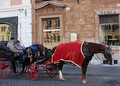
It looks like it's all kinda leaning to the left and backlit. I also think the conversion to B$W might not have been the best. White and green I think would have contrasted your photo even better. That's just one persons opinion though and I'm sure other will feel different. Good luck to ya!
The right side gives the idea of dead space. IMHO it would be better to have the dead space on the left, the direction the dog is facing. I also think some more contrast in this picture would improve it
Meets Challenge - 2
Lighting/Processing - 1
Composition - 1 - This would be better if the dog were facing the open space - so either slide your crop left, or have him facing right instead of left. You always want to leave your subject somewhere to go.
Overall Impression - 1
"WOW" factor - 0
Score: 5






 Add photograph to your favorites
 Add photographer to your favorites


 Photographer found comment helpful.


