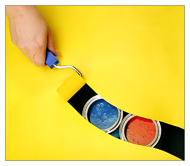
A sheet of yellow painted photo board on top of two tins of paint on top of a sheet of black photo board.
First I rolled a line of yellow paint on white photoboard then cut it out along the line. Then I painted the whole board yellow with the roller to get roller and photo board the same color.
A big thanks to Rolf D. for letting me use his idea, and of course to Nasti for setting up the lighting :-)
Statistics
Place: 1 out of 110 Avg (all users): 7.6644 Avg (commenters): 8.8286 Avg (participants): 7.5342 Avg (non-participants): 7.7945 Views since voting: 20596 Votes: 146 Comments: 97 Favorites: 89 (view)
This is a brilliant shot, kiwi, congrats on this one! When we have seen your win with Wickey, the first he asked: "Wow! How did he do that?" and there is also an unanswered question: "Who were so dare to give you lower than 10?" :-)
All cudos to you. But a picture like this is really all about the idea - once the idea is out there, it is too easy to copy. You say it was someone else's idea, in which case I think you don't really deserve a ribbon. Sorry.
Mind you - the image itself is great!
You're entitled to your opinion for sure, first time I heard that one though. If that is your theory then I guess many of the ribbon winners at DPC should give their ribbons back because they come from other ideas :-))) This photo may not have been fully my idea, but I still took the photo.
All cudos to you. But a picture like this is really all about the idea - once the idea is out there, it is too easy to copy. You say it was someone else's idea, in which case I think you don't really deserve a ribbon. Sorry.
Your technical perfection and amazing originality come together to produce some of the best shots here on DPC....I am in awe!
Congrats on 2 great shots.
My girlfriend and I have been debating quite how you did the paint, or rather lack thereof, strip. Any chance of a mini "How did he do that?".
I wrote it in the description to this photo actually. But I can elaborate a little. The board on top was a white board to begin with. I dipped the roller into yellow paint and painted the curve you see there. With a paper knife I carefully cut the curve out (that was the most difficult part cos you need a steady hand). After that I painted the rest of the board yellow, and Bob's ya uncle :-)
Although, somepeople would have prefered smoother paint, it would have made everything flat, and it wouldn't seem to have demsions as it does now.
I love the idea, and the colors! Really bold, the texture in the paint rocks. :P Hoorah for you and your 1st place ribbon, it's extremely well deserved
PS I like the bubbles too - the texture shows the paint is real and not merely two circles of painted card - and, although that wouldn't be a problem, I don't think it would look as good as the real paint.
The one thing that bothered me about this photo is that the paint in the tins is not smooth and flat. It didn't matter what I tried there were always bubbles on the paint's surface.
I *like* the bubbles and think they add dimension. But you maybe could have faked the effect by painting circles of board and placing them in the tins, or using another substance to "pretend" to be the surface of the paint.
Great, great, great work Gary! Congrats on another blue ribbon. I too cannot understand all the sub-5 scores. Can't please everyone I guess. You are making it sooo tough for the rest of us. Keep it up!
Thanx for all your comments and votes, much appreciated. I'm in a amazingly good mood at the moment :-)
The one thing that bothered me about this photo is that the paint in the tins is not smooth and flat. It didn't matter what I tried there were always bubbles on the paint's surface. So, I just had to accept it hope for the best.
Another one I missed commenting on during the challenge - well done Gary. I'm so glad you've got yet another ribbon!
Goood, strong, dynamic shot - well designed and set-up. My only criticism was that the hand is quite flatly lit (but I know how tough it would be to resolve). Excellent stuff.
Now that's clever! Not only a good idea, but wonderful composition, too! Nit-picky: the colors in the paint cans have highlights I wish weren't there; I'd prefer to see them rich and pure. Super, super work here. 9
Almost an abstract, and the illusion of removing paint with the roller is very effective. Imho the hand detracts from the abstract quality - leaving it out (perhaps by cropping part of the roller handle) would make a more effective shot.
Nice image. Yellow and blue are a terrific combination. I'm not sure that the "rust" color adds too much to the color contrast you've established. The concept is super but I would tone down the hand a slight amount. Nice use of the diagonal leading line.
This is so cool! I can't wait to hear how it was done. I'm looking and just quite can't figure it out! Exposing the other colors is great, though I would have used a secondary color for the top and the two reveled would the the primary colors that made that secondary color. Starting with an 8, will be back.
I'm back and to show you just how slow I can be sometimes, it just dawned on me that you were using ALL primary colors, DUH! Raising my score to a 9
WOW! VERY NICE SHOT. Great creative thinking here. You got a 9 on my first pass... When I come back through, you may get my 10. Nice work. I\'ll congratulate you on your ribbon ahead of time.
Second Pass: 10!
Simple yet elegant. The selection of primary colors here is inspired. I wonder how many people will recognize this amazing subtlety, that primary colors are hidden in all others. Incredible concept. Lighting and shadow are very good. Great execution. High technical quality.
I think this is a tremendous idea. This is one of my favorites this week as well. I love the simplicity and the strength of the color. I would like to comment on the color though... As I look at this image, I ask myself if the overall presentation would be stronger if you had chosen blue as the surface color instead of yellow. That would possibly create a stronger contrast for your hand in the upper corner. It would also possibly make a nice bright yellow dot by having a can of yellow paint being 'exposed' as well. Great work... = 10
Strong primary colours and novel answer to the challenge. 10 from me. Apart from the pure photographic excellence the "Exposed" theme has more than one interpretation.
Great Idea!!!! I wish I had the brain's to think up somthing like this.. Great composition...Great color scheme... Exellent lighting.. Very bright and artistic!!!!!
Good Points: nice clean & sharp image! very original, very well composed, excellent idea, great color combo and nice frame to boot!
Bad Points:None at all - which is rare in this exposed challenge.
Score:10 and the best of luck to you.
Excellent, very clever indeed. I am only left wondering if you left that one strip unpainted, or masked it somehow and then removed the mask (as in sticky tape, not photoshop. Then again, there may be a completely different way you achieved this one. The lighting is fantastic. Hopefully a ribbon here!
Wonderful idea! I love the vivid primary colors playing off each other and the black. The hand seems a bit unfocused, but since my attention is drawn towards the paint cans, that isn't a huge deal for me. Great use of space as well. 7
neat neat neat! the only quibble I have with this outstanding image is that the hand seems out of scale to the paint cans, as though they're very small or very far away.
Very vibrant colors. Love the beautiful line that is opened up to reveal the blue and red paint cans. The framing works will with the shot. This would make for a great advertising for a paint brand.





 Overpainted
 Add photograph to your favorites
 Add photographer to your favorites

 Photographer found comment helpful.


