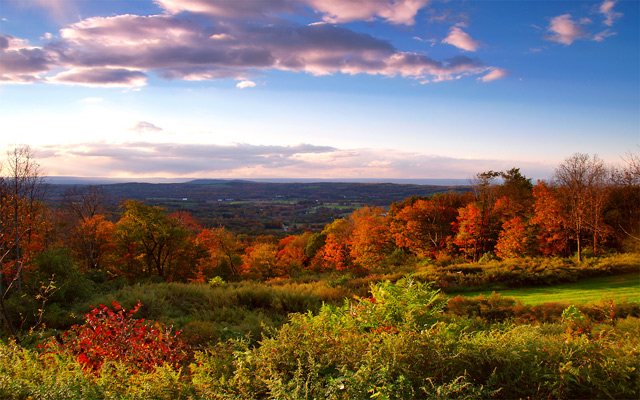
I'm going through some of the comments I have made and clicking on those the didn't check the helpful button. Some of them I totally understand why and have no problem with it (including yours) so I'm trying to leave comments that ARE helpful. For the photo itself (not the wrong challenge issue) I think it is a very nice photo. Not sure if you increased sat in pp but if so then maybe just a bit too much. You have to find the happy medium. You want to saturate a bit more to make the sky pop and it looks great the way you have it right now except the red trees are just a bit oversaturated. If it fit the challenge I think I would have given it a 7.
Ok so it was very late at night after coming home from a night out and obviously I my perception was a bit off when I read and entered this challenge. I must have gotten excited that I took this photo within the challenge date and I could have sworn it said something different.
In any case, thanks for all the comments, wish it would have rated a bit higher but I can understand considering the circumstances. Seriously though, those of you that left critique's thanks again, any advice is helpful.
Stunning color, a beautiful image. I really want to give this a high score but I'm struggling with the definition of portrait. Can't really vote it low because it's too good. Aaagghh.
Nice landscape in landscape... unless you were shooting for "portrait of fall". Still, I bet you're getting eaten up by the voters. =) It's a nice shot, though a touch oversaturated, IMO.
This is neither a portrait landscape, nor a landscape portrait - but a landscape landscape! But of course you know that by now!
Lovely Autumn foliage and great light. I would try not to put horizon dead centre though and aim to include a focal point if possible, such as a tree in the near foreground or bird/animal/person for scale, etc. Witha tripod you could get closer to a fern and get massive depth of field at around f16+ and ISO 800 (focusing about 2/3 into your distance here) or so. This could give a lot of drama and some interesting detail.
Hope this helps cushion your disappointment at being in the wrong challenge!
; j
I'll let everyone else tell you DNMC; here's what I like about the picture. I like the sets of lines and how each is different: foreground bushes, red tree line, hazy horizon, even those top clouds. The colors aren't oversaturated the way so many are over in the Free Study challenge. Nicely composed, well-thought out shot.
Ouch... not only the wrong challenge, but in a landcape format it doesn't fit the other challenge either. FWIW, the image itself had lots of potential. I'd suggest cropping about 1/2" off the bottom and showing more sky to get the horizon out of the center. Then I'd frame it and display it proudly as one of the prettiest sub-5 entries on DPC. ;-)
Such a beautiful shot. Too bad you are getting slammed for this challenge. I also took the landscape route and will join you at the bottome of the pack. Van
Sorry. Usually I'm quite generous on DNMC pictures, but this challenge was so clear that I'm being much more harsh. Which in this case is a pity, as it's a nice shot, and the colours are just gorgeous.
Meets Challenge - 0 - This is not a portrait. This is a landscape in landscape orientation.
Lighting/Processing - 2
Composition - 2
Overall Impression - 1
"WOW" factor - 0
Score: 5
Pity you completely missed the Challenge theme... Why did you enter for PORTRAIT in LANDSCAPE orientation? Your photo is LANDSCAPE in LANDSCAPE orientation. If you turned your camera 90 degrees and entered the "Landscape in Portrait orientation" you could have walked off with a ribbon.





 Add photograph to your favorites
 Add photographer to your favorites


 Photographer found comment helpful.


