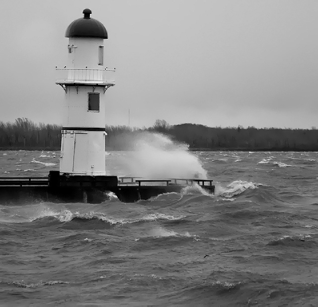
The black and white helps convey the stormy feeling this imparts, and the bend of the trees in the distance emphasize the direction of the wind. The water in the foreground has almost a painted look to it which is kinda cool!
The horizon looks level but the lighthouse doesn't...I hate when that happens. I think an average of the two might have helped better (?) or lining up the vertical crop with the lighthouse instead. However, it's a lovely shot and I still think it's good for an 8.
One of the few pictures that really looks like it was taken in the wind, but is it so windy that it's blowing the lighthouse to the right? 8) I like the b&w. Makes it feel like a cold winter day.







 Add photograph to your favorites
 Add photographer to your favorites

 Photographer found comment helpful.


