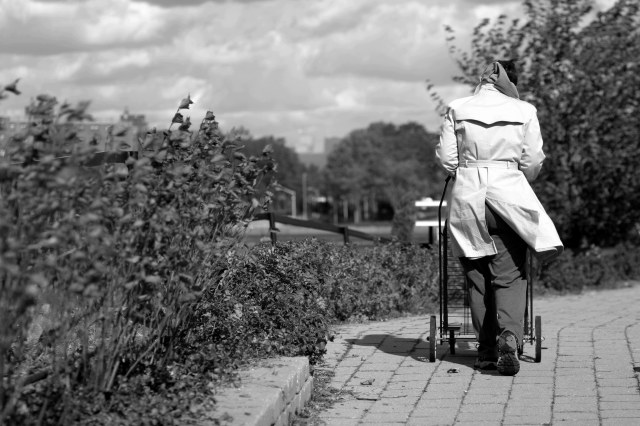
I like the foreground blur on the left. Helps to take that out of the viewers way and lead to the person. The brick lines also help out in that regard quite nicely. You've done a nice job indicating wind and meeting the challenge theme. B/W works well here, but I think the range is a bit short when it comes to blacks (could be deeper - or it may be this cruddy monitor). Well done overall. Good luck in the challenge.
The first thing that strikes me here is the great dof. Then I'm taken by the tonal range. So you're way ahead of the game even before I see the wind. Good on you, this is a lovely submission to the challange :)





 Add photograph to your favorites
 Add photographer to your favorites


 Photographer found comment helpful.


