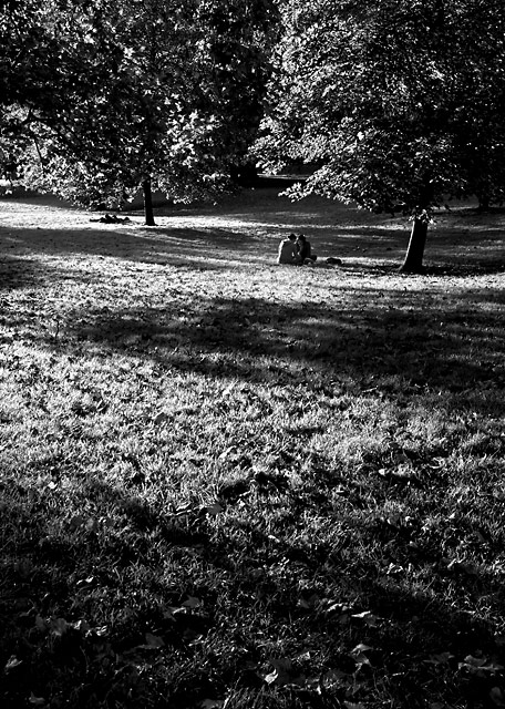
i like the high contrast but something about it just seems so harsh...almost to the point of hurting my eyes. i played around with it a bit and this is what i came up with.
duplicate layer
gaussian blur at 5.0 px radius
opacity reduced to 15%
light smart sharpen
sorry for being so presumptuous as to offer suggestions to someone of your obvious talent. i very much admire you and your work.
A nice romantic autumn feeling is in your photo. Wonderful lighting. I think you did right to render it in b/w although I expect the green grass also looked good. 8.
The interplay beteen the light and dark areas of this are really interesting. I think black and white was the right chocie as it wouldnt have the same effect in coour, i also like the placement of the couple well into the image.







 Add photograph to your favorites
 Add photographer to your favorites


 Photographer found comment helpful.


