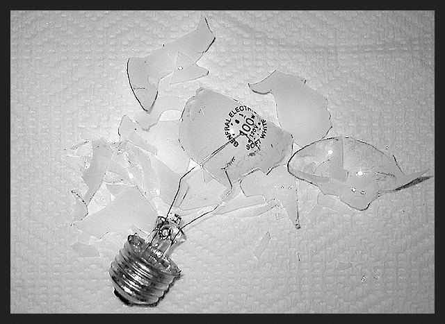
I have been playing with this idea all week since the challenge was announced. I finally acted on it. I took over 60 shots on two different backgrounds, black and white, different angles, different settings on my camera. This is the one I finally settled on. I don't like the background, it is distracting but I couldn't find a plain white sheet! And paper washed out the silver/grey on the bottom of the bulb, didn't like that effect.
I cropped, resized, sharpened, grayscaled and bordered.
Statistics
Place: 104 out of 110 Avg (all users): 4.6197 Avg (commenters): 4.1818 Avg (participants): 4.1690 Avg (non-participants): 5.0704 Views since voting: 1301 Votes: 142 Comments: 13 Favorites: 0
Wow! Reminds me of my current low, low scores on challenges. I guess my "idea bulb" has been "restructured" much like this one. (Hopefully, soon I will have a 5600 K model reinstalled in its place.)
Oh, well, congratulations on a little "light house-keeping." :) Stan
A really engaging idea here! Composition is nice. Try experimenting with this shot (or a similar one) with sunlight--but in the shade. I think your tones will end up being more pure and natural.
Interesting idea. Two things I'd like to critique on here though. 1) the background is not very image enhancing. I would rather have gone with something without a pattern on it, maybe some photoboard perhaps. This background has a kind of soft feel to it, which is contradictory to a broken light bulb. 2) This image is way oversharpened, a little less USM would have avoided this.
Great Idea!!! But I would have done without the paper-towle! Maybe on an all black background, or solid white background. Great composition and great lighting!!!! 8
Good Points: none, sorry
Bad Points:quality os poor, why shoot on a rasied surface? Also not enough balck in the image to warrant a thick balck border.
Score:1








 Add photograph to your favorites
 Add photographer to your favorites

 Photographer found comment helpful.


