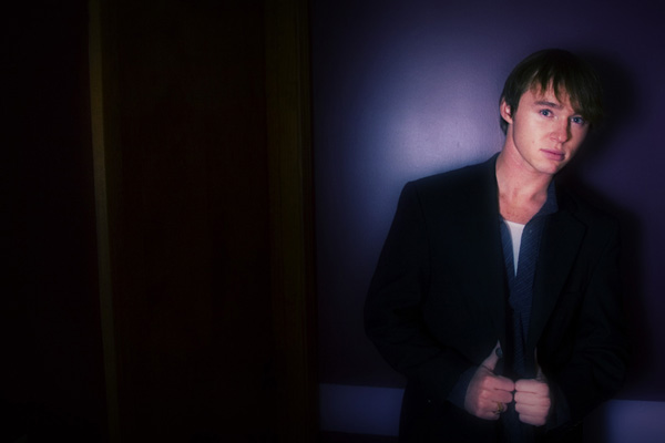
On the negative space, this image was not shot for this competition, but rather for a portfolio book that I happed to be working on the day the comp was started. This image is stretched between 2 pages, the subject on one page and the "blank" area on another and is used as a container for some other images of the subject and some text.
This was my first entry on this site and I'm happy with my placing, thank you all!
Nice pic but it needs a different composition to bring more focus to the subject (move over from the left). The overall feeling is soft but the focus is a little too soft on the face. I like the lighting, particularily the blue tones.
This is odd, but your subject sure looks like the "Braxton" I saw on the TV show Miami Ink the other night. I saw the show and recognized the name, then had to come and see the pic again.






 Add photograph to your favorites
 Add photographer to your favorites


 Photographer found comment helpful.


