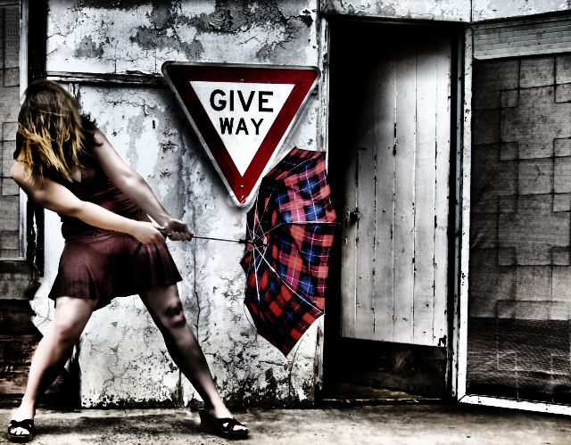
love the grungy look. The composistion seem slightly off and you can tell it's not really windy, but you made your point clearly. That sign is priceless. 9
gritty feel(a bit much on the model but great on the rest), like the punch of red throughout, like the face full of hair as it adds to the wind, sign is an added element that make this a full story -- one of my favorites this challenge
While it is a great concept and set up, I find the post work to be over the top. This could have been so much more with less. Having said that though, I'm almost certain this style would appeal to many DPCers and I predict a good result for you :)
An excellent composition. She's not giving way at all and the processing is unique enough that it adds to a great image and in fact enhances the style and mood. Of course it's posed but so what. Ah what the hell coming back for the extra mark for coolness... :)
Interesting idea and I like the look. However, the processing on the model seems a bit overdone and picture seems unbalanced with more color in center and left. 6
The processing is heavy here, but I really like the result!! It has a young feeling to it and it's very artistic IMHO. I love the different textures of the background done in a dirty white and the reddish tones of the sign, the dress and the umbrella. The "Give Way" sign and the half opened door are a touch of genius! The pose is wonderful and the hair over the face adds even more interest to the composition.
This is a great idea, and all the elements should work, but to me the net result feels staged and fake. One problem is that the model's hair and dress don't match the wind force implied by the stance and the umbrella. Also, the tones of the whole image are almost cartoony - and her right arm in particular looks oversharpened. Still, it's an ambitious and creditable effort.
Hmmm. Will a slightly overprocessed image still do well at DPC? Certainly time will tell with this one. It's a neat image (pun not originally intended, but fits) that is well thought out and fun to look at. Given the severity of the umbrellas' condition, your hair should be blowing around a bit more to really sell the concept. Good luck in the challenge.
The colors of the model & umbrella are nice and composition is well done. But, I'm not a fan of all the charcoal coloring (all the added black soot effect).
I like the shot and the treatment given to the photo in post editing. I willcomment on what appears to be a slight overuse in noise reduction at the expese of detail. Either way, a really good submission and the best of luck!






 Add photograph to your favorites
 Add photographer to your favorites


 Photographer found comment helpful.


