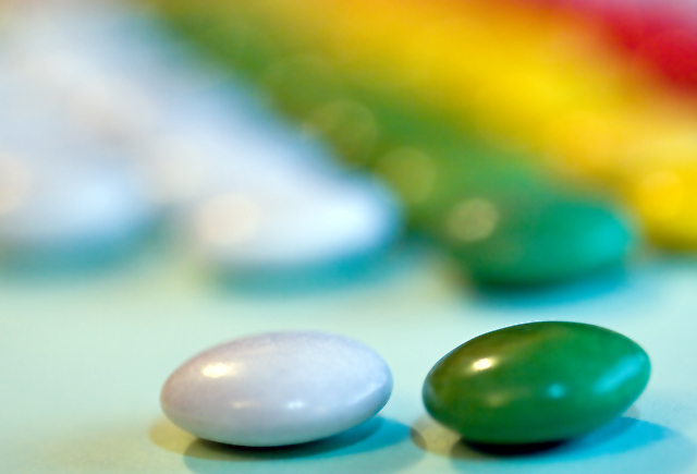
Yep, the two smarties were low on focus. I really didn't notice it, because of how the smarties are fairly smooth. They are definitely smarties, at least over here in the UK. They are not the same colours as they used to be, though. I agree I should probably have had a band of colour to the left for more impact.
Statistics
Place: 279 out of 440 Avg (all users): 4.8855 Avg (commenters): 4.8462 Avg (participants): 4.8507 Avg (non-participants): 4.9219 Views since voting: 1024 Views during voting: 356 Votes: 262 Comments: 14 Favorites: 0
This was a really good idea. The only thing I can add to all the comments made during the challenge, is that I'd like to see how it would look with the position of two candies in the front reversed. I think that might balance the composition more, and give it a little more punch.
Those arent Smarties. At least not in America. Nice lines and patterns inthe background that really pull this image. The two up front seem a bit soft and the shadows arent the greatest. The colors dont feel as vibrant as they might have been which could have offered more bang. Ditching that far left line and replacing it with the red from the right may have been nice as well. A shame to hide that color off to the side.
I actually consider this more to be a good shallow DOF than bokeh enhancement. The light source is a bit strong and produces multiple shaddows on the two subjects. Good composition.
Clever title. I think technically it could be a little better - the front candies are not perfectly in focus, and the lighting seems to be both blue and yellow (tungsten and natural mixed?) which makes it tough to get a good white balance.







 Add photograph to your favorites
 Add photographer to your favorites

 Photographer found comment helpful.


