There's not really anything here to keep my attention. More contrast might have helped the image pop a bit, but there still really isn't any obvious subject to draw attention to.
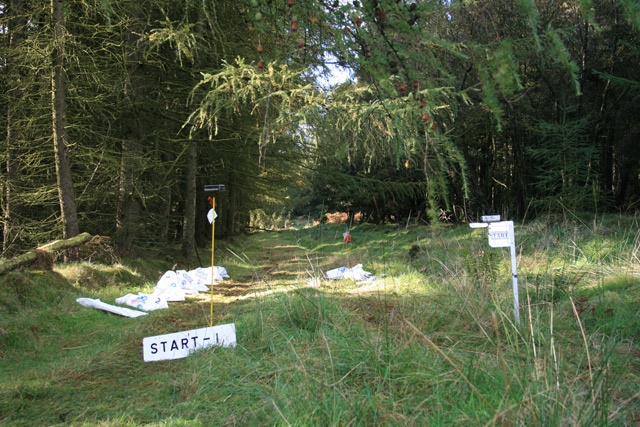
This is kind of a confusing image, and were it not for the title, I'd be lost. I am guilty of not giving images ample viewing time before voting, so speaking from experience, it's difficult to vote on confusing ones in just a couple of seconds. The image itself seems to need some contrast and maybe a bit more saturation (it could be my crappy monitor), which might give it more "oomph."
Nice choice of an atypical sporting venue. The path/road gives a good direction for the eye to follow. I might like this better compositionally if the perspective were lower to the ground with the start sign prominent - might bring the focus to feet. Does that make sense? Just my 2 cents. Thanks for sharing.
Disc golf, right? My son's into that. Nature's arena. I guess that's fair. Picture's not well focused, though. And, you could have given more thought to your composition.
overall score: comp-1,meets challenge-2,PP-0,impression-0,wow-0 = 3. sorry.
what I would change here is to work a bit with saturation and contrast, to make green woods stand out. and also I would have checked exposure before shooting. you see - these white things (what is it?) are overexposed, they are just some white spots.
good luck!






 Add photograph to your favorites
 Add photographer to your favorites


 Photographer found comment helpful.


