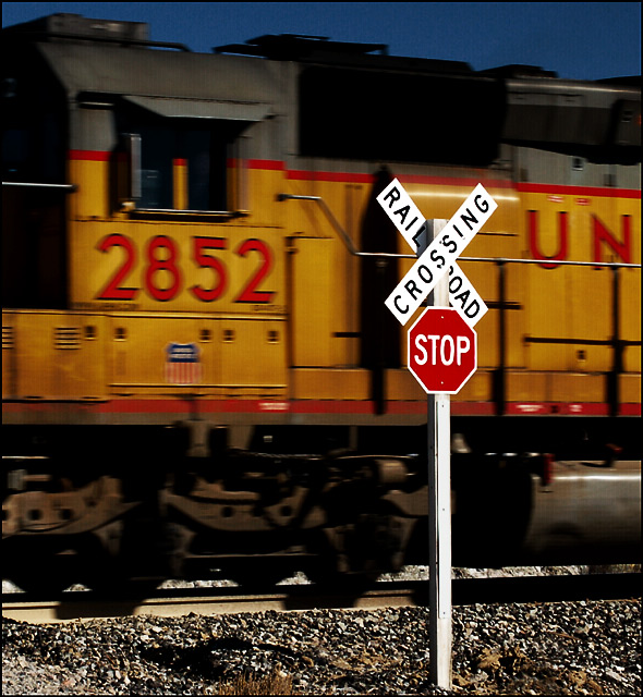
I really like this one! The tack-sharp focus on the crossing sign against the faint blur of the engine is genius. I've seen similar shots where the blur of the train is so extreme that you can't tell what it is. Others where there is no blur so the train looks stationary. This has just the right amount! The deep blue sky adds to the shot as well. Great photo! Adding to my favorites. May come back to bump this up when I get done with all of them.
The colors and composition are fantastic. I wish it had been taken at a faster shutter so that the train was not blurred. Rather than appear moving, it just appears out of focus to the viewer. 6.
I love the idea behind this shot and the colors are pretty good (though the sky is a tad darkish). If it were me, I'd have the sign closer to the right side of the picture, cropping to just the left of the "U", but that's just my personal preference.
I do like this...perhaps a smidge slower shutter speed would have created more movement and the sign would have really popped, but nice...great as a square crop




 Add photograph to your favorites
 Add photographer to your favorites


 Photographer found comment helpful.


