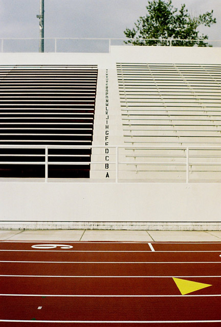
I love the ascending alphabet. It's like a George Lucus film credit disappearing into the distance. But, what really makes this photo for me are the shadows in the seats on the left. I don't know how you got that effect, but it's genious. Should be one of the top 10. 8
In my opinion this would have been a much stronger image if you'd cropped just above the last row of seats and left out the tree and light. The lower part has beautiful lines to it.
I'd crop out the top area with the sky and the trees, and perhaps shoot from a lower angle (squatting or kneeling, possibly). Some contrast and saturation could make it pop more.
There's some trippy illusion going on here. I actually broke out a ruler trying to figure out why the shot feels like it's leaning to the right. Good shot, though.
Aw MAN! So close. I like this, don't get me wrong, but why didn't you crop off the top of this photo (just above the top row of seats)? Eliminate that distraction and you have some interesting lines and colors working together. For me it would have added at least 1-2 points in scoring. Honestly, when this loaded in my browser the first thing that jumped out at me was the alphabet leading up the steps. :D It's when I scrolled down to view the rest of it the whole composition thing really became obvious.





 Add photograph to your favorites
 Add photographer to your favorites


 Photographer found comment helpful.