I really hope this photo does better than my last ones have been doing. My goal is to get a 6 or above. But I will be happy with a 5.8. I just can't wait to see something other than 4's and 5's. :)
curves, levels, contrast, selective color, sharpen, crop, save for web.
:)
Statistics
Place: 88 out of 196 Avg (all users): 5.6432 Avg (commenters): 7.4286 Avg (participants): 5.3600 Avg (non-participants): 5.8938 Views since voting: 913 Views during voting: 320 Votes: 213 Comments: 12 Favorites: 0
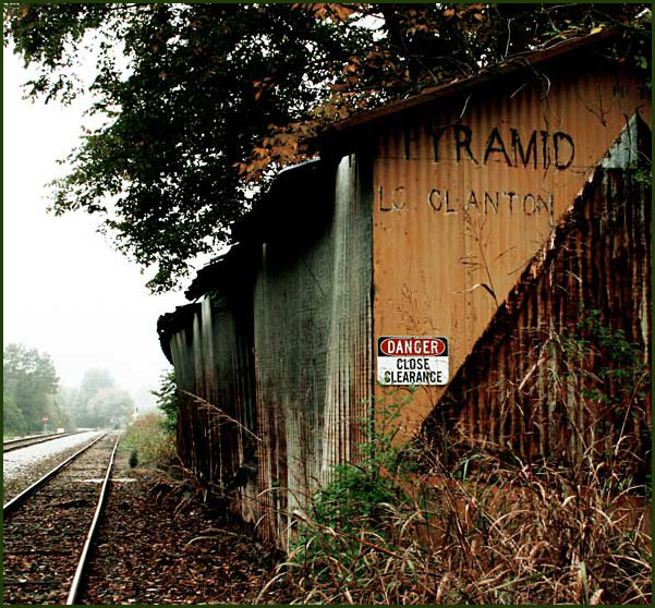
I gave this a 7. Pictures I like get 7 or higher. I liked the strange diagonal on the wall of the building, and how each building seems to be at a different angle. I like when a picture disorients me like that. I like the blown out sky for where the rails disappear, but not as much up top where the tree leaves look scraggly and have no detail or texture. But I love the overall composition, where the diagonals of the buildings compete with the more expected perspective diagonals of the train tracks.
Another reason I didn't go over 7, besides the scraggly leaves, was that the sign you made your title wasn't very interesting to me. I'd've liked it better if you tore the sign down and left me with YRAMID LO CLANTON. No one would mind if you tore a little sign down, would they? :)
This is terrific! The angle on the roof and the dirt slope both push my eye to the tracks. They almost leave me feeling off-balance, like I'm going to fall in front of a train.
Interesting picture. The composition is great. Unfortunately there is too much contrast in the scene and the upper tree shadows became blocked along with the sky being washed out.
Nice sense of rural America (or maybe Canada). The tracks disappearing off into the distant fog adds to the feeling of abandonment and neglect. I would have liked it a little sharper I think, and just a little more detail in the shadowed trees overhead.







 Add photograph to your favorites
 Add photographer to your favorites

 Photographer found comment helpful.


