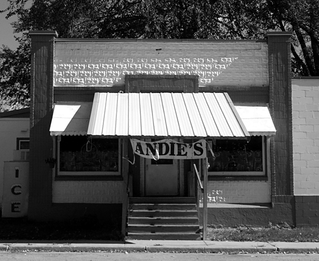
The lighting is a bit harsh, but the symmetrical composition works well. The Andie\'s banner provides a needed contrast to the rectangles so prevalent in the image.
Maybe a trim at the bottom ....too many lines going on. That or backing up to show more of the street. Not too bad, just a little oof but I like the black and white here.





 Add photograph to your favorites
 Add photographer to your favorites


