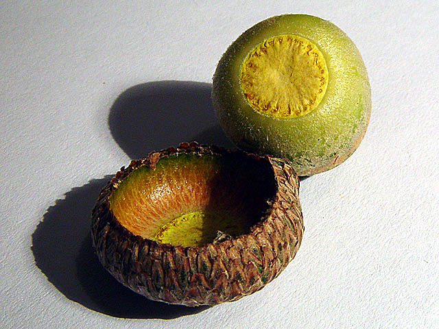
I think the lighting is too strong on the right side... it might have been better to pull it up a bit - the shadow on the inside of that acorn casing is a bit much also. I like your composition and placement in the frame.
Simple composition, very clean. I like the no frills look, they both have a good focus, the colors are natural and the lighting works well. Would've liked to see the entire inside of the acorn cap, just to extend that 'exposed' feeling. Great work! 7
My kids love taking the tops off the acorns and then gluing them back on, LOL, go figure! Great idea, the shadow on the top is wonderful, it draws you into the picture. It does seem just a bit oversharp to me, starting with an 8, will be back to look again.
Good job using lighting to create some extra effect on this macro. The detail here is excellent. When working with macros, you have to pay extra close attention to the finer detail like that small spot just off the left edge of the top shadow. It's a minor thing but it shows up with more strength in a closeup photo.






 Add photograph to your favorites
 Add photographer to your favorites


 Photographer found comment helpful.


