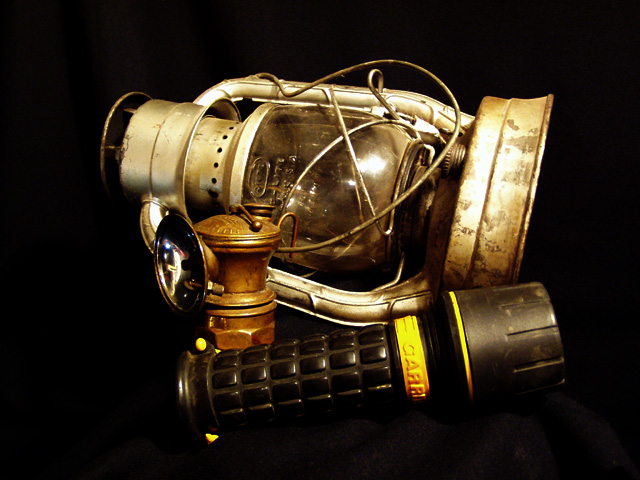
I'd rather see this without the flashlight. I think the composition could be more appealing if the lantern weren't knocked over. Good background, nice coloring.
Striking and such a wonderful deep black background. Did you clean it up or did you shoot it so wonderfully black to begin with? I like the limited colour scope, everything in golds, yellows and bronzes plus the black.
This would have gotten a better score from me without the flashlight. The flash in the glass and at the bottom of the lantern are distracting and makes my eye want to focus there. =7 syamjonimi
Nice arrangement of lanterns through the ages. Well done for taking the time to find this collection. Your picture is nicely focussed but lacks detail in the shadow areas. It looks like you've pushed the contrast too far. Overall an excellent shot.
It just looks like a jumble of crap. it looks like you just tried to put them as close together as possible and then took a snapshot of it. Try setting thsi up again and moving things around. If the big thing is a lantern why not try standing it up. How about showing the front of the flashlight. At this angle it could be something else. Also, the black flashlight blends into the background. Try doing this on a white background. Also, try coming up with a title. Untitled just doesn't fit. It illustrates a lack of creativity and effort to try and make the best photo you can. -Chariot
Something old. Use your photographic technique to emphasize the age of your subject. Composition - quite good. I would like to see it witout the flash light for comparison Technical Aspects - very good Meets Challenge - yes Visual Impact / Originality - high
might have worked better without adding the newer flashlight. would be cool to use the black background and put a light behind the lantern so that it looks lit
You should not (in my opinion) have used the modern torch. It also makes the picture too busy. Lighting is great, in fact, that torch is really my only beef. An old light in the dark would have worked really well... Sorry to sound so negative. (5)
Nice image. Find the composition distracting though. Some items are barely recognizable and it might have been better using fewer of them or re-arranging them.







 Add photograph to your favorites
 Add photographer to your favorites


