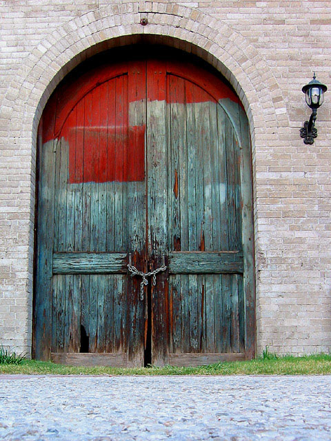
Good subject matter but the door is a little off-centered. Perhaps crop the pic off to center the door and eliminate some of the walkway in the foreground? This would also probably look amazing in black and white. Good job! - 8
Great shot. The nice detail really brings out the texture of the door. Cropping out the light might have been a good idea because it seems to take your eyes away from the door.
Nice, love that the door is partially painted and shows the remnants of previous coats. Although the low viewpoint makes one appreciate the size of the door, I'd be interested to see it face on, if it's big, maybe taken standing on a chair? The lamp by the door looks new and jars a little with the fabulous door.
I stared at this photo for about 5 minutes trying to decide if the door being off center because of including the lamp mattered to me or not and I still don't know. I really like the colors in this photo but I think it may have looked a little better if it was more centered since the symmetrical door fills the whole frame and is the main subject.
Somebody didn't finish their job, ha ha! (paint). I like it. Reminds me of the old barn door at my grand dad's farm. I'm not sure, just an idea, but maybe this shot could have put the door in dead centre ... some people believe that the rule of thirds should always be followed. I don't. Oh yeah, I give it a 7.
interesting example of old :) In this image, I think i would prefer to see the door centered and the light removed from the image... the light isn't really contributing anything to the image and it is keeping your door from being centered in the frame... - jmsetzler
i really like this composition and the punch of red. that's awesome! I wish the bricks looked older...maybe if you had played with the color levels/saturation a bit this would have looked really old. 7 LIsa






 Add photograph to your favorites
 Add photographer to your favorites


