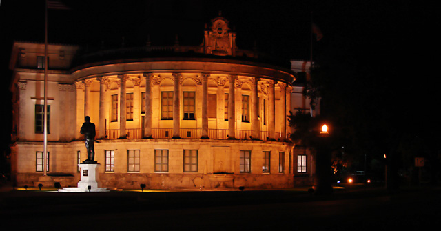
This is a nice image and good illustration of the lighting challenge criteria.
The areas I see where this could be improved are: (just my opinion of course)
The white base of the statue is a bit stronger contrast to the yellowed building then i might prefer. The image is also offset based ont he crop. The negative space to the right does not really enhance the photo so by vertically cropping closer to the building (maybe by the street light), I think the image would present itself better. |





 Add photograph to your favorites
 Add photographer to your favorites


 Photographer found comment helpful.

