This is awfully small, both on the screen and in terms of file size - so there are lots of artifacts and it's hard to make out details. It looks like an interesting street, from what I can see, but I'd like to see it better.
A bit small and the car on the left is very distracting, a tighter crop, a larger picture would have gotten a much higher score. The light is good though the sky looks a bit washed out.
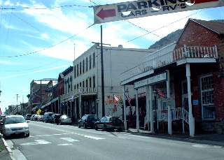
I'm afraid there's not a whole lot of "wow" here -- it just seems like there wasn't a lot of thought put into it in all honesty. The banner and wires are distracting, and the exposure is a bit too "contrasty," particuarly in the white of the clouds. I'd also try to submit shots a bit closer to the maximum size allowed -- this is just a bit too small to judge well. Just being honest...
A little too blue. In a small city like this, if you could maybe pick out one thing that is interesting and shoot a few frames with that as the focus, from different perspectives, you might find a more interesting picture.
base 1: 1/1; challenge: 3/3; technical: 2/3; aesthetics: 0/3; total: 6
Too small for my taste. Also seems too blue. Lines running across the top are distracting. Nice diagonal.





 Add photograph to your favorites
 Add photographer to your favorites


