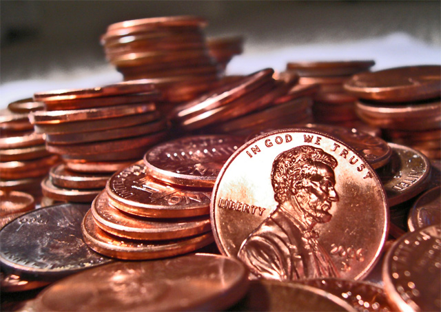
I like this idea and the lighting is good. I would have liked to have seen the pennies totally fill the frame - without the lighter background that is showing at the top. Maybe a few more pennies at varying angles for composition.
Oh man, I just love the composition here. And I hope people aren't giving you grief about the "blown highlights" because there isn't much detail in that area of the penny and the way you have the lighting really sets off the figure on the penny. Great job.





 Add photograph to your favorites
 Add photographer to your favorites

 Photographer found comment helpful.


