The comments you received in your forum post and in the comment section are accurate and hit the most blatant issues with this image. I would like to offer to critique an image of your choice, either from your portfolio or from a past or future challenge, as I don't have much feedback to offer on this image than what has already been given.
Feel free to PM me if you have any questions regarding this critique.
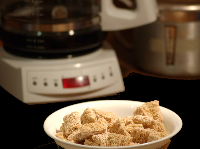
i am not sure how you got the black background, it seems you reduced the brightness in photoshop which created the edges around the blender and the cereal bowl. i think the picutre would have been a lot better if you actually put all the cereal bowl in perspective.
my reason for my low vote on this was that weirdness around the coffee pot and other thing. its splotchy and looked very out of place. made it quite hard for me to focus on the rest of the shot. theres a little of it around the bowl too. HTH
Just not tons of wow to this one. The focus is good but the subject matter just isn't what gives people that "Woah, did you see that one?" feeling, if you get my drift. I think I would not have cropped the bottom quite as tightly, either, so that the whole bowl is showing. Maybe even scoot down the table further to provide more of a "setting" instead of a closeup, if that makes sense. Hope this helped. ;~D
sorry but this editing is just sloppy. it looks like you selected the counter and either painted it black or reduced the brightness to 0 but you can see by the bowl and by the coffe pot where you missed spots.







 Add photograph to your favorites
 Add photographer to your favorites


 Photographer found comment helpful.


