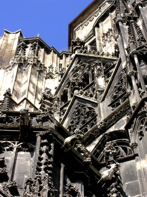
It's great that you got low enough to capture this good angle. There is a little too much detail crowded into this composition though. For the most part the dof is good. So is the light exposure. Although I love blue skies, in this case a black and white image would have sufficed. The blue draws my attention away from the detail of the subject.
I was facinated by this picture in the thumbnail as I couldn't figure out what you took a picture of. Now that I'm here looking at the real thing I think it's great. Technically very good, and I like your composition a lot.
Wow, this is an awesome shot! I would love to see this at full res, surprisingly though, it is still very high in detail even at VGA resolution. Great shot! -10
Good technical photo. Does not inherently promote feeling of oldness, however, despite the obviously old subject. Appears as though the subject is actually the architecture, rather than the age of same.
Beautiful, but a little too dense and confusing. I would have liked either more distance to see some shape and scale to the architecture, or a closer shot to pick up a smaller area of the detail.
what an intricate picture this made. I feel that the angle is slightly off, but without being there, I can't really tell what would make it better. Maybe the sun position would have added some depth to the ironwork if it was a little lower.
I like this shot! I have to minor complaints. First, I think I would have preferred either closer in to a smaller section for more detail (and maybe a touch less cluttered looking) or farther away to attempt to "take in" a more complete view. Ths second issue you couldn't really control. The shot is color (I think), but is soo full of greys, it seems black and white. I like grey, dress in grey all the time, but I don't think it photographs very well. Did you try this as a true black and white? I am still going to give you a 9, as the shot is that good. Swash
I'm just not sure what to make of this shot. I like the building against the very blue sky, the composition is very interesting, and it has "old" written all over it, but it is so very ornate that my eyes just doesn't have anywhere to "settle". lhall
wow! Subject is great, detail is great and DOF is great . Maybe a cropping of this differently would have worked better. Cropping out the blue sky would have been better, its a little distracting and takes away from the building.
It sure is detailed, but not too busy, due to proper use of color. The only distracting thing is the deep blue sky. I'd like to see this shot on an overcast day.






 Add photograph to your favorites
 Add photographer to your favorites


 Photographer found comment helpful.


