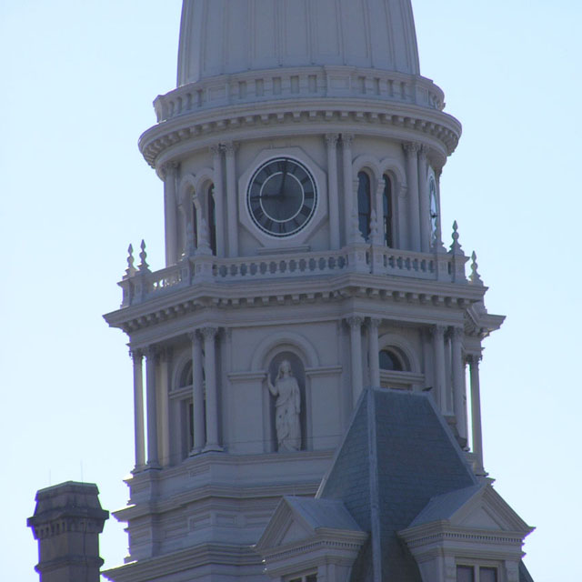
What a neat clock tower! There's a blueish halo around the edges on the left, where the light is so bright, and I wonder if it might work better if it had been straightened up - it gives the impression of leaning, this way.
Its a bit too flat You should have taken it on the side where the sun was shining, And you could have fixed the tiliting unless you wanted it like that It looks like its falling, anyway good picture that I think can be improved a little, Good job :)
I thought this was the leaning tower of Piza at first! The rotation is distracting, but shot lacks an urban focus particularly and lighting is a little flat with the sky causing a distracting brightness.
The lean to the left does this photo no justice at all. Didn't you realise the lean there, before you submitted? Well actually there is one photo of a building that does look awesome with a lean but that one is in Italy, and this isn't it. What a pity, because this looks like a real nice tower.
Good idea but IMO spolit by converging verticals and being off vertical as well.
A pity the light was so flat - I wonder if a boost to te brightness/contrats could lift it a bit? Overall does appear a bit soft, is this a tight crop of a much larger image?
The background is too bright for me, overpowers the tower itself. I really would have liked to seen more of the building itself and if the balance of light was better I would have scored much higher
Shame about the purple fringing which is beyond your control. The wonky tower is though... why didn't you correct it? The picture is underexposed (look at the clock), and I think the composition needs to be a lot more imaginative. 4
Hi there. This image leans to one side quite a lot. Have you tried rotating in Photoshop (or what ever program you may have). It would give a much better finish :)





 Add photograph to your favorites
 Add photographer to your favorites


