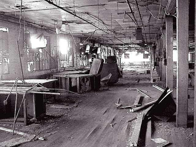
This pic would have been good except for two things: 1. the bright lights coming thru the windows (which is tolerable) and 2. not enough contrast (not enough dark and too much light).
Something old. Use your photographic technique to emphasize the age of your subject. Composition - pretty good Technical Aspects - pretty good Meets Challenge - maybe. Don't confuse old with broken down. Visual Impact / Originality - good
I think this is a wonderful shot, one of my top three this week. I assume there will be negative comments about "hot spots" and such like, but I find the whole thing effective. Jak
Good execution of the challenge theme. The bloom from the sunlight in the windows actually helps with the feeling of oldness. I wish the reduction process had not muddled the focus.
Yeesh, how bleak. What an awesome shot at conveying a message. The brightness in the window and at the end only make the decay (for lack of a better word) more obvious. Awesome picture. karmat
very cluttered image...it works well though. interesting interpretation of this weeks challenge. nicely done. ~mcmurma Aesthetics...7 Meets Challenge...7 Overall...7
This is definitely a scene that sparks 'old' in my imagination... The blown out lighting coming through the windows seems to add to the dark and dreariness inside this old work shop... good work :)
Very nice! I love this photo, particularly the lighting, and the framing. It has a great mood, although maybe being a bit dimmer would enhance that.... only a very minor nitpick. I still want to give it 10! - lisae






 Add photograph to your favorites
 Add photographer to your favorites


