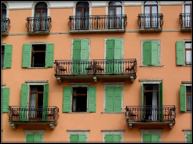
Very interesting. I wish you wouldn't have cropped the top arches off. I love the colors, and the architecture in the balconies, shutters and moldings. Lovely overall: 8
I like this subject. I just think that shooting it square on would have made the composition more balanced and 'designed'. The diagonal at the top is unaesthetic.
I like this image, especially the colors. It is unfortunate that the zoom lenses we use allow the image to be razor sharp level at the bottom like this one, but at the the top it is unbalanced.
This is a great building, and shot the colours and the balconies are great, reminds me of my trip to italy.
My only objection is I think I would like to see the white at top cropped out.
I love the symetry in this shot. However, the photo is slightly rotated and the framing doesn't match the symetry. It would have been better if you took the picture from a location cenetered about the middle of the long balcony.





 Add photograph to your favorites
 Add photographer to your favorites


 Photographer found comment helpful.


