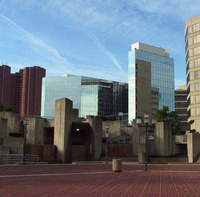
Thanks to all who commented. Many of you mentioned that it was a cold or desolate scene without people. That is what I felt as I took the picture and processed it so I am glad some of it came thru. A large city can be a cold, desolate, and impersonal place.
There are so many nice elements and contrasts in this picture. I like the various colors of stone against the glass and the older structure on the left included with the modern architecture in the center. My favorite is the earthtones in the foreground. Very nice capture of the artistry in this cityscape. Even the sky cooperated for you.
Nice array of shapes, colors, and textures. Hard to tell what the center of interest is; maybe it doesn't need one, but I'm having a hard time deciding what this image is about. The blue and red of the title are at the top and bottom of the image, separated by several layers of structure, so that doesn't seem to be it.
very nice photo of the various geometrically diverse buildings. Makes for a very interesting photo. I like the various heights and angles of all the buildings. The compostion is terrific.
great sky pattern and great reflections, the photo semed to be slightly cold without humans aruond, but its cool atmosphere that the photo captured that appealed to mi..
The location you shot from really adds more to this image than just getting a picture of buildings. The steps indicate there are people in the city and the different directions and groups of steps implies that it is a very diverse busy city. The lack of a city name in the title suggests the city could be anywhere in the world. Really good job.
I really like the composition in this image. It is well balanced and it all converges towards the lower right. The clouds are total bonus as they converg in that direction as well. It has enough colour in it to contrast with the beige staircases. Great image.
Very nicely done. I like the red brick and blue sky - I like the reflections in the glass. With all the buildings and a big expanse at center court there, it's almost a bit desolate as well. Nice job.
This looks so familier to me but I can't quite place my finger on it. I like the sense of balance in the picture, the title is fitting but I think I would have gotten a better sense of urban with a little less of the red brick.
For me, there are too many competing elements here, and I find it difficult to view. You've captured good color but I think that a closer view would have worked better.
This is one of my favorites so far. There is a lot of depth in this picture and it really captures the theme. The inclusion of different materials is nice (brick, concrete, glass)






 Add photograph to your favorites
 Add photographer to your favorites

 Photographer found comment helpful.


