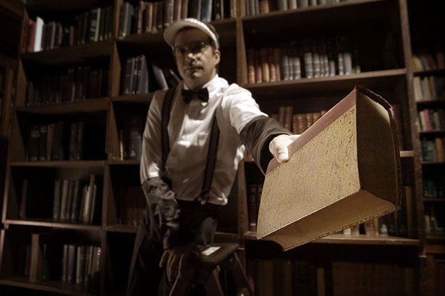
I think I understand what you were going for here: focus and light on the book as primary character in this picture: but I think that a greater depth of field would have been great: more focu to let the light do the talking. I love the tones and palette in this though.
Great idea, but I think you missed the shot. The outstretched arm is bathed in the light that should have been highlighting the offered book. Instead, the book is in reflected light and the image ,therefore, loses much of its power.






 Add photograph to your favorites
 Add photographer to your favorites


 Photographer found comment helpful.


