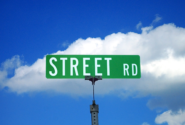
I am SO thrilled to have gotten into the top 20! Thank you very much for all the comments. For those who suggested a different angle... I would have, except the cross street sign would have been in the way. I was really pleased how it turned out anyway and glad others liked it too! Hurrah!
Statistics
Place: 16 out of 155 Avg (all users): 6.0588 Avg (commenters): 7.3000 Avg (participants): 5.8356 Avg (non-participants): 6.1343 Views since voting: 1774 Views during voting: 492 Votes: 289 Comments: 26 Favorites: 2 (view)
I think this would have looked good in black and white with a red filter to define the cloud better and with the sign away from the centre of your picture. 5
Wonderful find and the image is in good shape technically. I really like the blue sky and clouds in the background. Nice and simple. That's good for this image - anything else would be distracting from the subject. The one problem I see is the placement of the subject. Danged if you do, and danged if you don't I think on this one. As is, it's very centered. Some will like that. Many won't I'm afraid. That cloud in the background...it has a nice diagonal line to it. If the sign was positioned a little lower (meaning you would have had to elevate yourself), and to the right in relation to that background cloud it would be a stronger presentation IMO.
Sorry if it sounds like I'm nitpicking, but it's the minor details that can really move (or lower) a photo in these challenges.






 Add photograph to your favorites
 Add photographer to your favorites

 Photographer found comment helpful.


