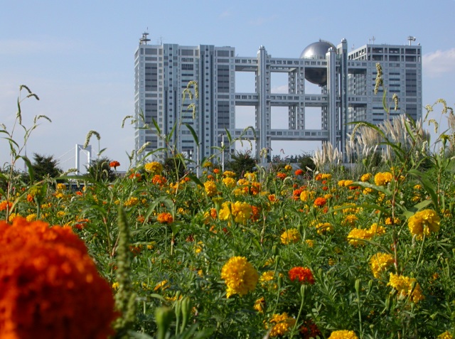
Thanks to all the persons who dropped a comment! Just a few notes. This photograph is meant as a counterpoint between urban structures and natural structures. Thus I wanted the image to convey this idea of each party trying to "take over" the other. Hence come both the large amount of foreground and the low perspective: I wanted the flowers to look as they were "competing" with the building. The out-of-focus flower at the bottom left is also there on purpose: I chose a round one because I wanted it to contrast with the steel sphere of the building. I wanted it to be out of focus because otherwise it would have taken too much of the viewer's attention. Most importantly, I wanted the viewer to feel the presence of the flower when watching the building, to be distracted by it - and yet have his eyes slip off it, brought away by the sharper focus of the rest. I am actually glad that so many people complained about the flower being "distracting": it is designed to be so. I wanted the flower and the building to actually compete, as visual elements of the image, for the attention of the viewer. This is meant to be a dissonance. Here you can see an outtake for the same subject: more building, less foreground, higher perspective, no flower - it's plain boring imho. ;)
Wow! This picture is AWESOME! The colors and clarity really make this shot but I also love how it relays a sureal feel. Almost like something you'd see in a futuristic movie. Nicely done.
I feel like there is rather too much foreground - especially with the orange flower to the left which is rather distracting. may have been better from a higher angle?
Very interesting shot. Too bad the big orange flower in the forefront is not in focus as it distracts a bit, but it is needed for balance of the off-centre shot.
I know it's hard to get front to back focusing in these situations, but that is what you needed to do in this instance for the best effect. The blossom in the fore that's so out of focus also detracts.
I like the concept you were going for here, the idea of nature taking back what is hers. The building offers a rather futuristic ideal to the shot, makin gone think that you were looking ahead, the only inconsistincy is that the building is still so new looking, if it was a bit grungier or aged I think I could score much higher on this shot.
I really like this photo. I visited Japan last year and saw this building...Its a tv or industrail sceince museum? I never did get a good photo of it. I like that you have the bridge in the backround also. It's very pretty.
Great contrast of environments, nice angle and lovely colours. Very intriguing structure too.
One thing I'd take note of is hyperfocal length (it's been in the forums - here's a good link: //www.vividlight.com/articles/2314.htm). It would ensure that the distant subject is totally crisp (which this isn't quite) as well as your foreground. Not a fatal flaw though - good work. [7]
Who's taking over - us or nature? A thought-provoking photo and a pretty contrast between the shapes and bright colors of nature and the stark monochrome of manmade buildings.
This is very striking! I love the balance of bright color and stark metal. Good composition here. Very otherworldly. The bridge detracts from the skyline, but I only noticed it on second glance.
I'll go against all the other people leaving comments and say I like the orange flower in the bottom left corner. It's a good contrast with the silver sphere.





 Add photograph to your favorites
 Add photographer to your favorites


 Photographer found comment helpful.


