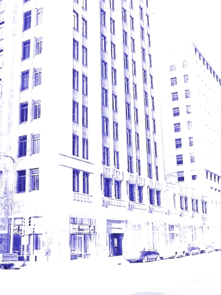
I think this is cool graphic work, but as a photograph Its too much contrast for me too white But I like the perspective and would love o see the original. good luck
A unique high key, high contrast approach. You've executed it well; the elements are easily recognizable, yet the image has a nice abstract quality to it.
it's an intersting effect, but I find it very harsh. as a stand alone photo I quite like it, it's interesting. for the challenge, it doesn't click for me. sorry.
i am afraid the color choice and having it so blown out does not appeal to me. My eye does not seem to have anything in particular to focus on, and the color choice does not invoke any particular feeling in me. (like a Red or Green might have) Find the color calming and makes me feel the shot is very static. Nor is it so changed that my mind does not immediately identify all the objects (which does fit the challenge I certainly can say).
I think this shot would work much better in it's original form. The effects you added really ruin the overall picture for me. It meets the challenge without a doubt.






 Add photograph to your favorites
 Add photographer to your favorites


 Photographer found comment helpful.


