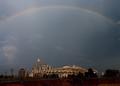
This image could be strengthened with a some brightness/contrast adjustments. (It seems a little flat) Otherwise, it is a strong composition and interesting picture.
I'd say up the contrast as much as 15 points and take the brightness down about 5.
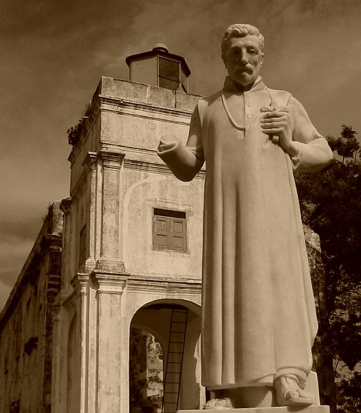
Now this is a different take on the challenge. I love seeing different interpretations, ones that don't always "go with the flow" and this one is both original and well composed. The poor guy has lost his hand :-(
I understand the coloring from your title but I think I would have liked this shot better in it's original colors. The shot itself if well cropped, the statue "looking" down is very appealing and the building behind conveys a very strong sense of urban to me.






 Add photograph to your favorites
 Add photographer to your favorites


 Photographer found comment helpful.


