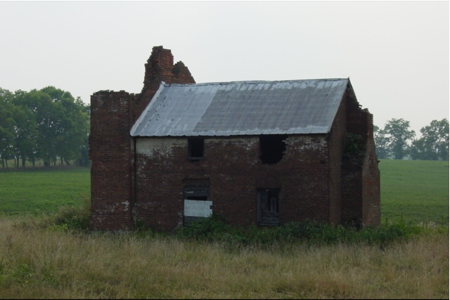
On my monitor I can't see the brick because the image is too dark. I'd also like to see it off-center. Sure does meet the "something old" challenge though.
Something old. Use your photographic technique to emphasize the age of your subject. Composition - good. Did you try tighter crops? Technical Aspects - pretty good Meets Challenge - yes Visual Impact / Originality - good
The colours are somewhat dull. It just looks like someone hit the mute button on it :-(. It really need a sunnier day I think but you might have been able to do something with Photoshop or similar.
A closer view of the "old brick" might have been effective to really give the sense of the brick. The sense of brick doesn't really show up here---maybe its just my monitor, but I would like to see the detail better.
It's a great subject but you took this at a time of day that cast very little light on this side of the building. As a result we can't see any details on the subject. Nicely framed by that open countryside though.
dark! building is in dis-repair, but it's hard to see it. I think the left side appears to be the most broken down, could you have taken this shot from that side of the building? If your camera supports spot metering, this might have been a good time to use it. 6 Swash
Nice subject, but I would like to see your composition follow the thirds rule here as well as more exposure. If the building were offset to one side and the bricks exposed more to bring them out in your picture it would be sooo much nicer. Autool
I like the softer focus, generally, but I think a little sharper focus might have shown the details better. Also, I think you need to be a little closer, so that it fills up the frame more. karmat
Cool old house but not a great photo - back lighting doesn't work. Slightly end-on angle doesn;t work for me, either exagerate the angle or straighten it. maybe something else could have been in the dead center? Like maybe the white boarded window?
i see two major problems with this photo. the first is the lighting, it is just a bit too dark to get any detail in the walls. the second is the composition. the straight-on... "here's a picture of an old house" look just doesn't interest me visually. the subject matter meets the challenge, it just wasnt presented in a very engaging manner. ~mcmurma Aesthetics...3 Meets Challenge...5 Overall...4
Auto metering was a little off here.You should play around with it a little. The building is very" back lit" this fools the meter and usually ends up with an under exposed subject. Try to keep the sky out of the picture unless the sun is behind you and shining on the subject.
I love the setting here. It's little too dark to see detail. I may have also avoided centering this or taken it from closer in and at a more diagonal angle. Lisa
This would have been a better photo if you had taken it under different lighting conditions. The sky is burnt out and there is not enough light on the building to see any details.
This is a good shot of an old building... the exposure doesn't show much detail... maybe the lighting was behind the building... this photo needs some more color punch to really stand out :) - jmsetzler






 Add photograph to your favorites
 Add photographer to your favorites


