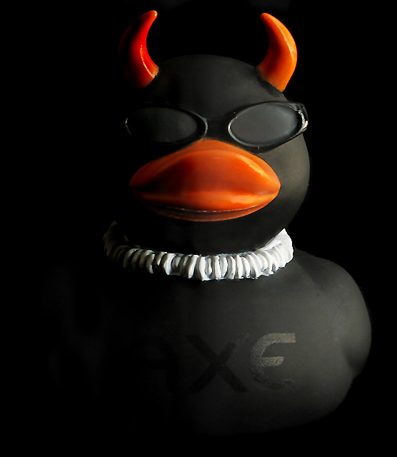
Challenge:Ducky (Advanced Editing IV*) Camera:Canon PowerShot S2 IS Location: my apartment living room Date: Oct 5, 2006 Aperture: F/4.0 ISO: 100 Shutter: 1 sec Date Uploaded: Oct 8, 2006
Set up the duck on a black backdrop and used a shop light as a reflected light source on the right side of the duck to shadow the left. Post processing involved dodging, burning, cloning out some areas on the duck to get rid of glare, level adjustments, curve adjustments, despeckle, and unsharp mask.
Statistics
Place: 96 out of 174 Avg (all users): 5.2265 Avg (commenters): 6.0000 Avg (participants): 5.1216 Avg (non-participants): 5.2750 Views since voting: 960 Views during voting: 356 Votes: 234 Comments: 10 Favorites: 1 (view)
Greetings from the Critique Club. I have been assigned your photo to critique and here are my thoughts:
Personal Reaction: To honest, I’m not resonating with this photo very much. But the challenge was whimsical and your photo exhibited a nice sense of humor, so let’s not take ourselves too seriously.
Composition: Frequently a centered composition doesn’t work very well and can feel very static. In this case it seems to work pretty well, I think because the orange lifts the eyes and the horns lead my eye back around into the photo. You’ve got a nice dynamic triangle going with the beak and the horns. So although you have a risky composition, I like it. Well done!
Technicals: Your lighting is very good. It helps me feel the texture of the duck. Your post processing added to the feeling by removing some glare, good job. I see what you’re doing with the side light and I like the definition and dimensionality it gives the duck. I like the resulting black on black contrast. Focus is good. DoF is good.
Conclusions: I can really see this image as the background in a magazine ad, or as the accompanying graphic in an ad. In that respect, it wouldn’t compete with words laid over the top and could really grab a reader’s attention. So why didn’t it score better? Those who commented seemed to like it. In the end, I think the subject (which met the challenge well) just didn’t appeal to voters that much. It’s a minimalist photo, not that there’s anything wrong with that. Maybe they were expecting more, or expecting yellow ducks, or … well who knows.
You haven’t entered that many challenges, but in your portfolio I see some real talent behind your photos. Keep shooting and you’ll find your style. Your technical capabilities are evident. IMO you just need to concentrate on subject choice and try to show your audience the subject from a perspective that surprises, or teaches, or entertains them.
As always, this is my personal opinion. Feel free to PM me if you’d like further dialog.
Thanks for all the comments. Some of you actually understood why it was lighted the way it was and some didn't...or maybe some of you just didn't like the lighting. Anyway, the lighting was done this way on purpose to contribute to the "dark" appearance.
I like the side lighting on this shot...it sets the mood well. I have to admit that I find the lettering on the duck to be rather distracting. The colors in the shot look good and the background looks very even.





 Add photograph to your favorites
 Add photographer to your favorites


 Photographer found comment helpful.


