Author Thread Comments Made During the Challenge
Post actions
Post actions
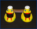
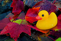
Ducky is a bit pale or washed out against such a bright white background.
Post actions
It looks like a glow in the dark ducky.
Post actions
nice placing.. perhaps a different coloured ducky would have added kick.. the line through the middle is showing and that seems to decrease quality..
Post actions
a little sharper and a touch of extra contrast would have done the job. still nice though.
Post actions
Post actions
I'd would like to see this with a stronger focus and sharper contrast. Still a decent shot.
Post actions
I really like the "lighter" tones of this photo....almost pastel. To me, it's really indicative of the title "Alone." To the left of the duck, I can almost see some kind of line in the background, which stands out a bit because of the light coloring. Other than that, I like the white background with this shot.
Post actions
The simplicity is really effective..good job!
Post actions
there a dot on the duck that is distracting me but otherwise cute light angelic lighting.
Post actions
Meets Challenge = 2
Post actions
Needs a bit more contrast IMHO
Post actions
I like the set up, but the colors are almost to soft for me






 Add photograph to your favorites
 Add photographer to your favorites


