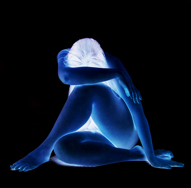
Graphically very strong. Good use of the square crop, with an almost perfectly symmetric composition, very well balanced. The post processing works well IMO. Good job on a difficult shot.
great pose. Fantastic idea to create the lit look of the head. i'll get picky and wish you softened the hair outline, as it looks like it was selected with the straight outline tool. Perhaps the blotchiness was intentional to create a marble/statue look, but I really would like to see this smoothed out.
So I have tried these before, and I failed, however I think this has perfect execution, and I sincerely believe it will do well. GL mate. I cant wait to see the final calculations on this one.
I think the negative filter adds too much light and vitality to an image that's trying to communicate a dark emotion. Good idea, maybe a little overboard with pp though imo.
I am [usually] not a fan of this technique but you've used it well as it plays into the composition. Not sure about the fit of title and effect (a slight negative). One of my ribbon picks.
Generally I dislike the inverted type shots like this. HOWEVER, this one really appeals to me. ?I guess it's the blue, the wonderful pose and the light on her head. Not sure but I do like this one a lot. I think you did a great job. Just her hand alone with the light/dark areas is a good photo!! Well done, you sold me.







 Add photograph to your favorites
 Add photographer to your favorites


 Photographer found comment helpful.


