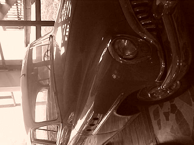
I can't for the life of me figure out why you wouldn't rotate this picture. The top (er left) of the image, though, is very washed out compared to the bottom (right).
Ok, I sat here for a few minutes looking at this picture...Could not figure out what to give it....Most of the cars have gotten a 5 from me...Wanted to give a low score since the car seems to be parked on the wall...but you know what...it's different...so I'm giving you an 8 :)
Should have flipped it 90 degrees to the right so it is straight. Also the "left" side of the pic is way too bright. My suggestion is to take the same pic on different seffings of apature and/or ISO and choose one that's "perfect" or at least one more dark than not. Why? Because it's easy to lighten a dark pic than try to lighten a dark one. The right side looks good, by the way.
I hope you reconsider and explain this perspective. It likley looks a little goofey to most of us. The top, make that the left side, is a bit washed out to me but I do like them old Buicks too.
I think this one should have been rotated for the best effect. Also, I would have tried to get more light on the front of the car, the back seems washed out while the front is just a little too dark for my liking.
Needs rotating, I know that's obvious but I can't even appreciate this one without twisting my head too far to be comfortable which doesn't make me want to score it highly. Also seems too faded at roof of car end and too dark at front of car end. Sorry!
did you place this horizontally on purpose? I don't think it adds anything. Vertical would be better. If I tilt my head I can see good composition, but there is also pixelation/dithering/compression artifacts.
Sooo many issues, so little space.....first, why sepia, it looks like a beautiful car and I KNOW it's old. Next, why on the side? Next, outside is overexposed, bad thing. Clear, well focused shot, but it still seems cloudy (could be the outside light again) Front of the car is too dark. I'd better stop before your score goes any lower (kind of a joke). 6 Swash
Doh! How did you make such an obvious mistake? What were you thinking? Were you asleep and just didnt notice that '57 fender on a '59 body? Oh, and the framing seems a bit lopsided.
i like this image, but i wish you had rotated it to vertical. the sepia works well here and the blown out highlights match well with the shadows in the front grille. ~mcmurma Aesthetics...7 Meets Challenge...7 Overall...7
It would have made me happier if it had been rotated 90 degrees clockwise. I don't know if this was a deliberate decision but if it was then in my opinion it was a mistake. The reflections on the car are lovely and there's a kind of mist in the air that adds a lot of atmosphere. Sadly all of that is distracted from by the rotation. There's also evidence of heavy jpg compression around the edges of the highlights. Overall it is a lovely picture. Just a shame about the rotation.
I think this image would have been much better if you had rotated it up to a vertical orientation. I don't understand your intention of having it horizontal like this.... I like the sepia toning, but the exposure seems a little hot. The high exposure in the background is washing out the details in the front end of this classic car... - jmsetzler







 Add photograph to your favorites
 Add photographer to your favorites


