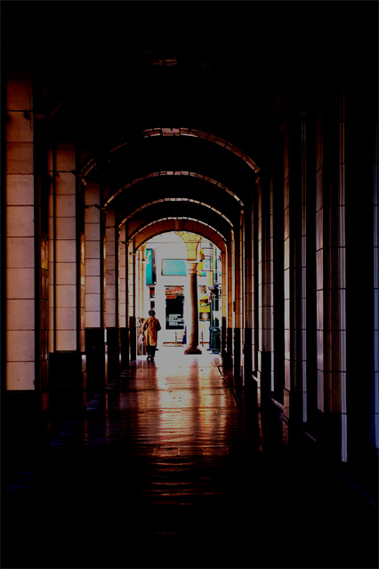
I was at one end, she at the other, and there was no one in between!!! (this location is usually busy). Focal Lenght was about 80mm. I was thinking of zooming closer but I thought the feel of the arches gave the photo something more.
Statistics
Place: 168 out of 185 Avg (all users): 4.5399 Avg (commenters): 4.7778 Avg (participants): 4.5000 Avg (non-participants): 4.5649 Views since voting: 1396 Views during voting: 334 Votes: 213 Comments: 15 Favorites: 1 (view)
Welcome to DPC. I must admit that this image has the most detailed comments I've seen of the nearly 100 images I have critiqued. I don’t' have a lot to add, as my impressions of this image before reading the comments mirror those of the comments you received. The two items that hurt your score the most is that something doesn’t look right post processing wise and that for the majority of voters, this does not meet the challenge as a portrait. Without seeing the original image, it is hard to make suggestions as to improving the post processing. Keep trying, the composition of this image shows that you have a good eye and once you master the post processing part and learn what works at DPC, you will find your score will improve dramatically.
Feel free to PM me if you have any questions regarding this critique.
just a bit too photoshopped i'd say, for dpc voters.
prolly would have looked great in black/white.
the comp is more about the lines and perspective than faceless.
just my opinion, hope it helps.
The forward part of the image is a bit too dark with flat mid-tones. An s-curve could have help your mid-tone contrast some. Also a bit of contrast masking could have helped pull some details from the shadows. (Both s-curves and contrast masking are covered in the forums - the master being Bear_Music)
You might have scored a bit better with a tighter zsoom as your subject sorta gets lost in the composition.
it's a nice picture. Lighting and composition is OK, but it's not even close to being a portrait - faceless or not...
A portrait should tell something about the person - this picture tells something about the place.
the composition is fair, but the colors are horrible. the end of the hall is too busy to see just the person. good idea, but not captured well at all. (1)
I'm not a technoid freak or anything but did you burn in your blown highlights? I find it difficult to deal with highlights like this and turning them a dirty grey doesnt usually help the image. Sorry for very personal opinion!
maybe a light at the end of the tunnel brightwhite would work better?






 Add photograph to your favorites
 Add photographer to your favorites

 Photographer found comment helpful.


