This is a nice scene as far as feel, but there's a lot of artifact here - diagonal lines in the near doorframe, and along the upper faces of the building; rough/blurry look making the signs harder to read than the size would seem likely to do.
base 1: 1/1; challenge: 3/3; technical: 2/3; aesthetics: 2/3; total: 8
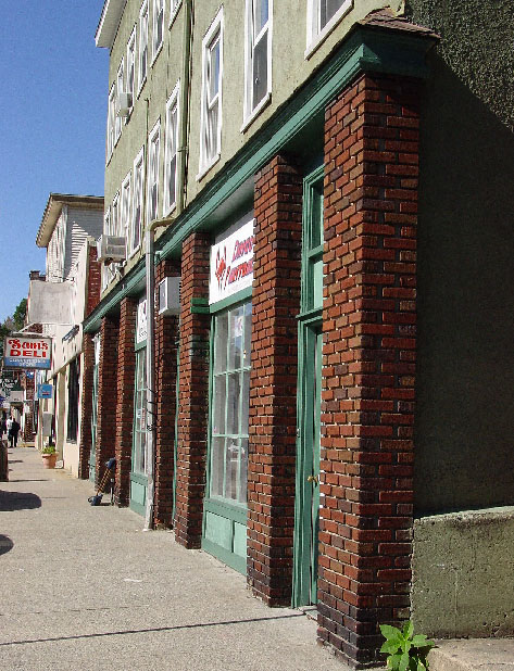
I rarely say this one: It looks over sharpened. Strange angles in the drain pipe and window just in front of it on the second story is where it is most noticable. It could use a pass through neat image to clean up the noise in the sky, but otherwise, great photo.
Image quality is poor and I think you could have cropped out the right side of the image up to the red brick. Effective use of perspective but it leads to nothing interesting.







 Add photograph to your favorites
 Add photographer to your favorites


 Photographer found comment helpful.


