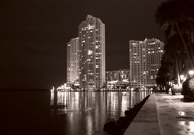
These buildings are beautiful and the cropping from top to bottom is very good but the sides are a bit distracting, the darkeness on the left and the trees on the right keep pulling me out of the main shot. I would really like to see this shot in color too, the black and white is nice but I think you lost some of the punch by going b&w.
A tripod here would have helped prevent the blur in the lighting. I find it rather distracting. I am also not sure why you chose black and white here. I don't think it helps your photo...
Wonderful shot, I think B/W was a great choice. I do how ever think that the 2 lights on the left side are a bit to distracting due to their brightness.
The black structure forming a border at the left-hand edge would add interest, but in my view there's too much of it and it becomes obtrusive in an otherwise very nice shot.
This is great!! The only thing I would change is to bring out the horizon on the left, but I would imaging that to lighten the whole image enough for that would blow the highlights unacceptably. Anyway, I love it!






 Add photograph to your favorites
 Add photographer to your favorites


 Photographer found comment helpful.


