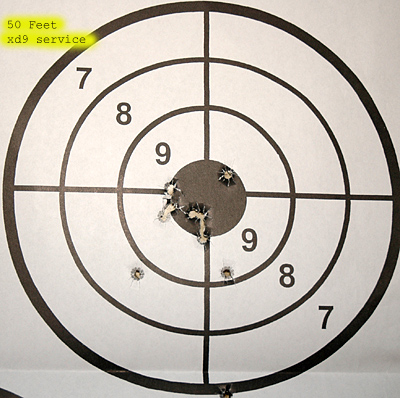
I think the light is a little harsh. Also, lowering the saturation would have done wonders for this shot.
The black at the bottom left is a little distracting.
I do like how the numbers draw your eyes through the bullseye though!
FYI... If you plan to use this image in a challange, don't forget to remove the text at the top left.
Kenskid
;-) |




 Add photograph to your favorites
 Add photographer to your favorites

 Photographer found comment helpful.


