That's funny. visual plays on words always (well, often) make me smile. Nice lighting. Nice contrasty colours. For me, the bottle should be central or 1/3 across, not just a little off centre. Makes it look a bit like you missed
Too funny. Almost doesn't need any text. A less centered comp would help if it (text) were needed. The problem with ads like this is that we'd be laughing our collective heads off with this it would probably be deemed "too risque " for the general public. Lighting is a bit harsh and perhaps a different color background to make the label of the product stand out more would make this a servicable advertisement.
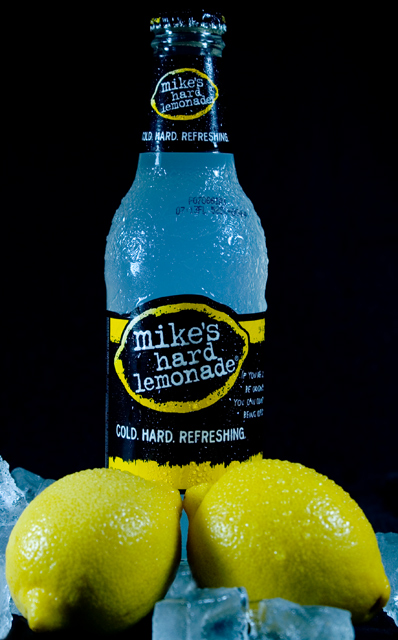
good lighting and colour, and obviously you are trying to be cheeky...but the lemons should have been in focus as well...put the camera on a tripod, stop down to f16 and shoot the image sharp...just a suggestion





 Add photograph to your favorites
 Add photographer to your favorites


 Photographer found comment helpful.


