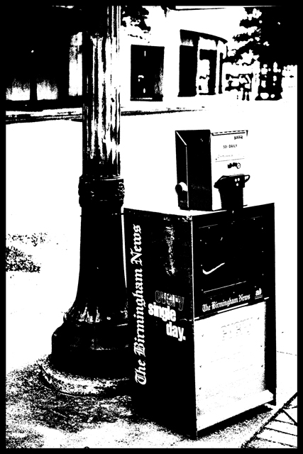
Whoa....4.8 was a bit harsh for this shot IMO. I voted it 6 during the challenge - I thought it was a cool shot but a bit too overdone giving it a cartoon feel. Now that I'm looking at it again in preparation for this comment, I'm attracted to the shot more...oddly BECAUSE of the clean cartoon feel. If I were voting again it would be 7 (not exactly a huge help now eh?!). Sorry. I like that you took a chance and went all the way on this...just like an artist should.
The composition is strong and solid. It is definitely "contrasty," but I imagine it simply didn't appeal, visually, to many. It's almost as if by eliminating all of the middle tones, the emotion or story of the shot is gone as well. I think if you could have achieved the contrast without so much obvious photoshop it would have been better.
This picture is an excellent example of high contrast imagery. You did the job right and don't think different for one instant based on your score. Scores like yours make me shake my head at DPC voters. I gave you that '10' and I'd defend that rating to anyone that questioned it.
I think this effect could have been achieved with almost any photo. Too much contrast, and overall somewhat plain subject matter. Perhaps a little less background detail would have worked better.





 Add photograph to your favorites
 Add photographer to your favorites


 Photographer found comment helpful.


