Ahhhhh, yes... a well balanced daily diet! I didn't know you were a health nut.
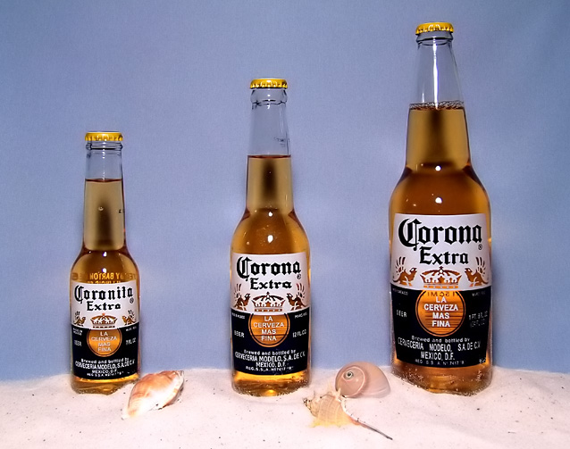
Creative idea. DPCers always like humourous creativity. Lighting on the bottles is just fine. The muted blue backgound works very well with the bottles and its lighting is well balanced. Usually having the subject that close to a wall isn't such a good idea but in this case it works because of the light reflections from the bottles adding to background interest.
Color is a little weak. Saturating that gold and adding a bit more contrast would give it more punch. The biggest technical issue you must overcome first, though, is with the foreground... it is overexposed. That can be reduced nicely with Shadow/Highlight in CS2 or with twiddling a variety of basic legal adjustments in PS7. The detail is there, you just need to bring it out. The foreground is an issue in any case because it looks artificial, especially where the sand meets the wall. Adding some plant greenery would add more interest to the composition and maybe cover up the sand/wall seam. ;)
Looks like dinner is either slightly tilted left or lens distortion is making it look like it. That is a slight distraction.
the background i think depreciates the photo. Maybe black or something more vivid. I'm not sure, I just know the blue gives it a generic feel. And aside from these comments I think the photo is terrific and a great leap above avg. GL.
An added lime would've given this ad so much more. nice lighting and presentation of product. Sands a nice touch but I would've gone with a different color background.
blue background does not render the yellow of the beer. i'd prefer some kind of landscape behind the bottles. and a sunshine - if it's put as if a sandy beach.





 Add photograph to your favorites
 Add photographer to your favorites


 Photographer found comment helpful.


