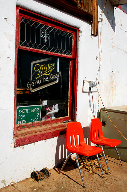
Didn't post during challenge, but I just had to say this was one of my favorites and am sad to see it as low as it is. I thought not having an actual can/glass/drink in the picture was very refreshing! Also, the composition, colors, and concept really appealed to me.
While maybe not great as an advertisement this picture is highly effective. I like the subtle humor you created by the title of the picture and the sign in the window. The vivid colors draw your eye around the shot forcing the viewer to explore the photograph.
A tighter crop may have serve this better to display the miller logo more Prominently. If they could've turned it on it would've been much better. Nice comp and colors.




 Add photograph to your favorites
 Add photographer to your favorites

 Photographer found comment helpful.


